Sunday 11 December 2011

Photographs For Double Page Spread

In this lesson I had to chose which pictures I was going to use for my double page spread. Below is the picture I chose to put onto my double page spread, the other pictures are the ones I was going to use however did not end up using them.

This image is the only image I used on my double page spread. There was not enough room for another picture because I used this picture to cover a whole page so that the writing was on the other page. This worked well.

These pictures are the ones I did not end up using.


Photographs For Contents Page

Below are all the pictures I have used on my contents page. I had to pick which pictures I wanted to use in my contents page, I have also stated why I have chosen these pictures.

First, is the picture of a person doing a Loser sign with their hands. This picture relates to the Glee series as this is their signature hand gesture. Everyone knows it means Loser and will immediately relate it to Glee.

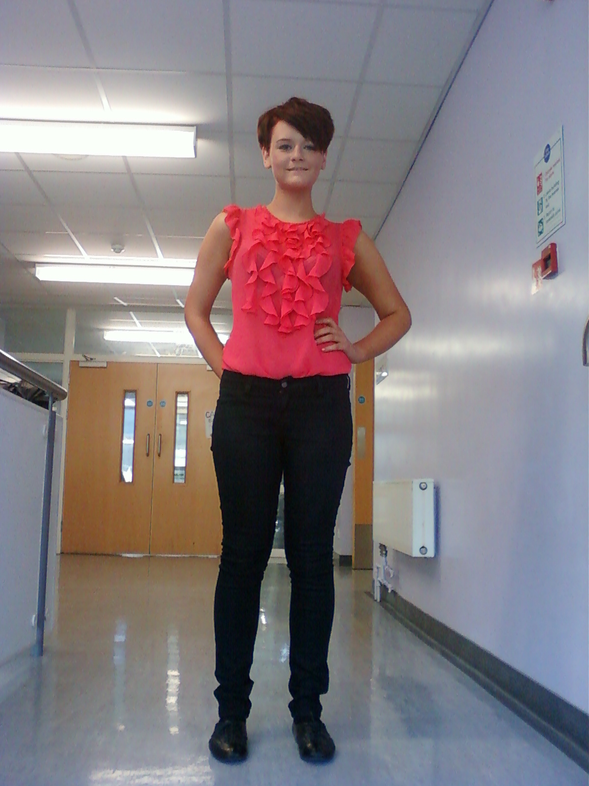
Second, is another picture of the same girl on my front cover, usually in magazines the person/people on the front cover have a different image on the contents page. I have chosen this image of her because I like it and it fits in the space on my contents page quite well.

Third, is a picture of The Saturdays at one of their concerts. I have chosen this picture because it fits into the space on my contents page very well and I like that they are sort of in the middle of dancing.

Last, is a picture of Tom from McFly at one of their concerts. I have chosen this picture because I like his face expression and I think it is a good picture. I made this the biggest picture on my contents page because out of all my pictures it is the best one.

Photographs For Front Cover

(Below are all the pictures I have used on my front cover. I have also stated why I have chosen these pictures)

I have chosen this picture as my main photo because I like that you can see her face up close and her top is bright and eye-catching. This is the only picture I have used on my front cover because I think that other pictures will draw attention away from the main image. 


Below are the pictures I took however decided to bot use on my front cover.


Friday 2 December 2011

Production Of Double Page Spread

Here is a sketch of my double page spread. this will help me to decide4 what I will put into my final double page spread.

(Below are step by step screenshots of how I made my double page spread. I created this throughout multiple lessons. I will then hand a copy of it into my teacher so she can look at it to see how I can improve)


Unfortunately I had to cut some of the questions I asked in the interview off due to not having enough space. I also had to delete the picture of the person I interviewed. However all the questions I asked are below in the actual interview with the fan. Clearly you can see that the questions I asked are magenta and the answer I got are blue; this is so the audience can see which are the questions and which are the answers.


As you can see from the screenshot below I have changed a lot of my double page spread around. I have done this as it looks better also not all my interview questions would fit on therefore I added another page so the audience will be able to read all the questions. As you will also be able to see I have put in another picture of The Wanted (Max, Tom and Nathan). I think this is a good picture and the audience will like it which is why I added it in.


From the screenshot below you can see that I have changed my double page spread quite a lot, I have gona from 3 pages back to just 2 pages. I have gone back to the original picture I used becuase I had to move this onto a whole page. I made the image as big as the page so it really jumps out to the audience. Since my picture is on one side of the page my writing is now all on one side of the page. My title is over the picture as is my sub-headding. I have created a dropcap in order for the audience to know where the article starts. Think the layout is good and will be easy fo the audience to read/look at.

Monday 28 November 2011

Production of Contents Page

Below is a sketch of my contents page. This sketch will help me to decide what I will include in my final production of the contents page.


(In this lesson we had to start creating our contents page. Below are stage by stage screenshots of how I created this)


Below you can see that I have added in my title of the magazine ‘Louder’, this so the audience will remember what this magazine is called.

As you can see by the screenshot below I have changed a considerable amount of things on this contents page. I have moved around the writing so the page numbers are in order. I have made the sub-headings smaller in order to make all the writing fit on one page and I have got rid of The Wanted ‘Gold Forever’ single cover so I can make Tom with the guitar the biggest on the page. This picture now does not look stretched and I think this looks better than it did.

I have only changed two small things this time. I have deleted the word page from contents page, this tells the audience what this page is. I have also deleted page 20 the editors letter as this would normally be only the contents page therefore I do not need it.

I have changed my contents page a little bit again. I have changed a few of my article names so that the names I have mentioned on my front cover are in the contents page. I have also put blue boxes around the picture page numbers so that it stands out more to the audience. The last little bit I changed was the Wins title, I made it bigger so it does not look too stretched. 


Thursday 24 November 2011

Production of Front Cover

Below is a picture of a sketch of my front cover. This will help me to know what I will include in my final front cover.

(In this lesson I began to create my front cover on Adobe Photoshop. As I made and changed different things on the front cover I took screenshots of it. Below are these screenshots)


I decided to change the colour of my writing because I think this looks better than before and is now starting to look like a real pop magazine. I bought Sam forward so she was in front of the writing because most magazines do this therefore I thought it would be better for me to do it as well. I also moved around some of the writing to make more room for the main coverline, for example I moved ‘Frankie Cocozza kicked off X Factor?’ to the other side of the page, this also looks good.


Blow is another screenshot of my newest front cover. Again I have changed a few things. I have changed the name of my magazine to Louder as I think this sounds better and relates to the music genre more. Due to this I also changed the slogan to ‘turn it up louder’ again this relates to the music genre when people turn the music up louder. I got rid of the black boxes on the top right hand of the page because there was too much black, usually pop magazines are light coloured. As well here I changed Olly Murs to Marcus Collins. I did this because I moved Olly’s name to the other side of the page. I also changed ‘outrageous celebs’ to ‘outrageous Olly’ because I think this sounds better and I also moved it so it is not slanted on the page. I changed one of the cover stories from ‘Frankie Cocozza kicked off X Factor’ to ‘Bieber Fever Fans’. The last thing I have changed was the writing in black box at the bottom, I changed Nicola’s name to Pink as Nicola is not as well-known as Pink.


As you can see from the screen grab below I have changed a lot of things again. I think the front cover now stands out a lot more. I have put a shadow around my title so the audience knows this is the title of the magazine. I have also moved my writing around the page, the Alicia Keys story is at the bottom, Bieber is at the top, boy bananza is at the side inside a blue box, both exclusives are inside different colour boxes and Olly is inside a white box. In addition, I have changed the main article quote around so ‘make music’ is on a separate line. You may also see that the slogan is changed to blue this is so it matches the circle. 


Once again I have made a few changes. I have deleted the white boxes because I have not used boxes anywhere else therefore it looks better. Also Bieber Fever Fans was not all in capitals so I have made them all into capitals so they stand out more and is the same as the other headings. The last little thing I changed was the writing in the bar across the bottom, I put The in front of Saturdays and changed the and to a & sign. This saves space and gets right to the point.

Below is a screenshot of my front cover so far, I have added lots of boxes to it to make the articles stand out. This is not my finished production because I know that I want to change it further. I may change the colours of the boxes and make them smaller, I may also put a background on it to make my picture stand out however I have not yet made a decision to what colour. 

Here is a screenshot of my front cover so far. I have put a yellow background on it to make my image stand out and appeal to the audience more. I have changed the colours of my boxes like I said I would; I changed them to black and white because I think this is more interesting and eye catching. I moved my slogan to the other side as I have more room there. I moved Sam Roberts down so there is more room for the boxes on the right hand side. As well instead of having a circle with Boy Bonanza inside it I changed it so it is in boxes and matches the other articles I chose to be on my front cover. I think this looks better because it is more eye catching towards the target audience. 

I have made two little changes. First, I have made my boxes blue, white and pink which is my colour scheme therefore it blends in better than the black and white I used before. Due to this I have changed the writing inside the boxes this colour as well so it balances the colours out more and I don’t use too much black. The last little change I made was moving the date of the magazine to below the title on the right hand side, this gives me more room by my bar code to move the issue number up.